CASE STUDY
Lazeez Mediterranean Restaurant App
Project Overview
Client: Lazeez Mediterranean Restaurant — a beloved, family-owned local eatery renowned for its authentic halal food and homemade baklava.
Platform: Mobile App (iOS & Android)
Role: UX Designer (User Research, Wireframing, Journey Mapping, Interaction Design)
Timeline: 8 Weeks (from research to high-fidelity prototype development)
Project Type: UX Design Case Study (Pickup-Only Food App)
Problem & Goal
The Problem
Lazeez, despite its popularity, lacked a digital platform for customers to efficiently browse the menu, place orders, or manage pickups. Many patrons, especially busy professionals and parents, relied on calling in orders. This manual process was time-consuming, inconsistent, and often inaccessible for customers with specific needs. Key pain points identified included:
Manual credit card entry over the phone, causing frustration.
Text-heavy menus that were difficult to scan and process, particularly for users with dyslexia.
Inconsistent pickup times, leading to unnecessary waiting and uncertainty.
Absence of reward tracking or favoriting options to encourage loyalty.
The Goal
Our primary objective was to design a fast, intuitive, and visually engaging mobile app. This app would empower customers to browse the menu with rich visuals, place orders, and manage pickups seamlessly, effectively eliminating phone orders and significantly reducing wait times.
“Our goal is to let customers skip the line, customize their meals, and pick up food seamlessly — saving time without sacrificing taste.”
User Research
To understand the core needs and frustrations of Lazeez’s clientele, we conducted in-depth interviews and empathy-based observations with three distinct user groups:
Busy professionals working near Lazeez, seeking quick lunch options.
Parents with demanding evening routines, needing convenient dinner solutions.
Gig workers (e.g., ride-share drivers) looking for fast, reliable meals between shifts.
This research confirmed our initial assumptions and revealed the critical pain points listed above, highlighting the urgent need for a more efficient and user-friendly ordering system.
Personas
Based on our research, we developed three key personas to guide our design decisions, ensuring we addressed the diverse needs of Lazeez’s customers:
Emma — The Young Intern
Age: 22 | Location: Charlotte | Occupation: Intern “I often grab lunch for my team to show initiative — I need it to be quick and easy.”
Needs: Speed, clear options, easy ordering.
Fatima — The Nurse Mom
Age: 39 | Location: Hickory | Occupation: Nurse “After 12-hour shifts, I want to grab something healthy and get home to my kids ASAP.”
Needs: Efficiency, reliability, quick family meals, clear dietary information.
Omar — The On-the-Go Driver
Age: 28 | Location: Charlotte | Occupation: Uber Driver “Time is money — I want food that’s ready when I arrive, no waiting.”
Needs: Real-time updates, precise pickup times, minimal friction.
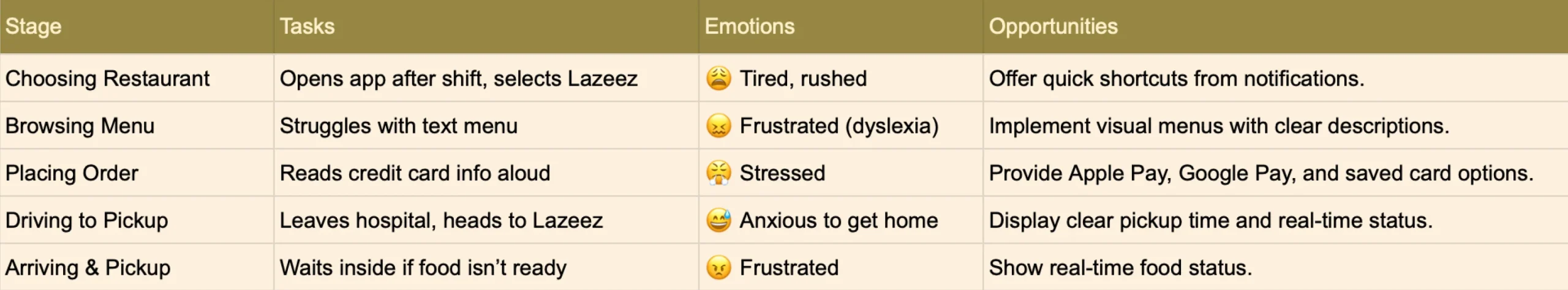
User Journey Map: Fatima's Evening Rush
To truly empathize with our users, we mapped Fatima’s typical evening journey when ordering from Lazeez. This exercise revealed critical emotional highs and lows, and pinpointed opportunities for design intervention that directly informed our app’s features.
Wireframes & User Flow
Our design process culminated in high-fidelity wireframes that prioritize a seamless and visually rich user experience, directly addressing the pain points identified.
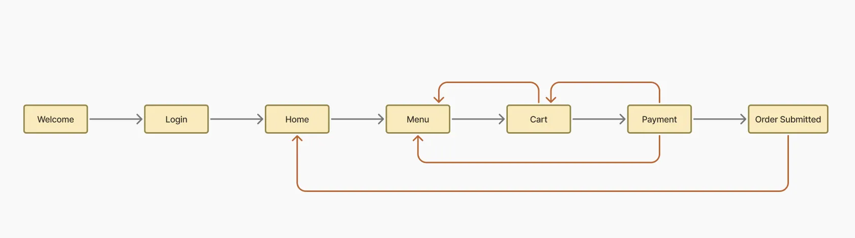
Key Screens and Design Highlights:
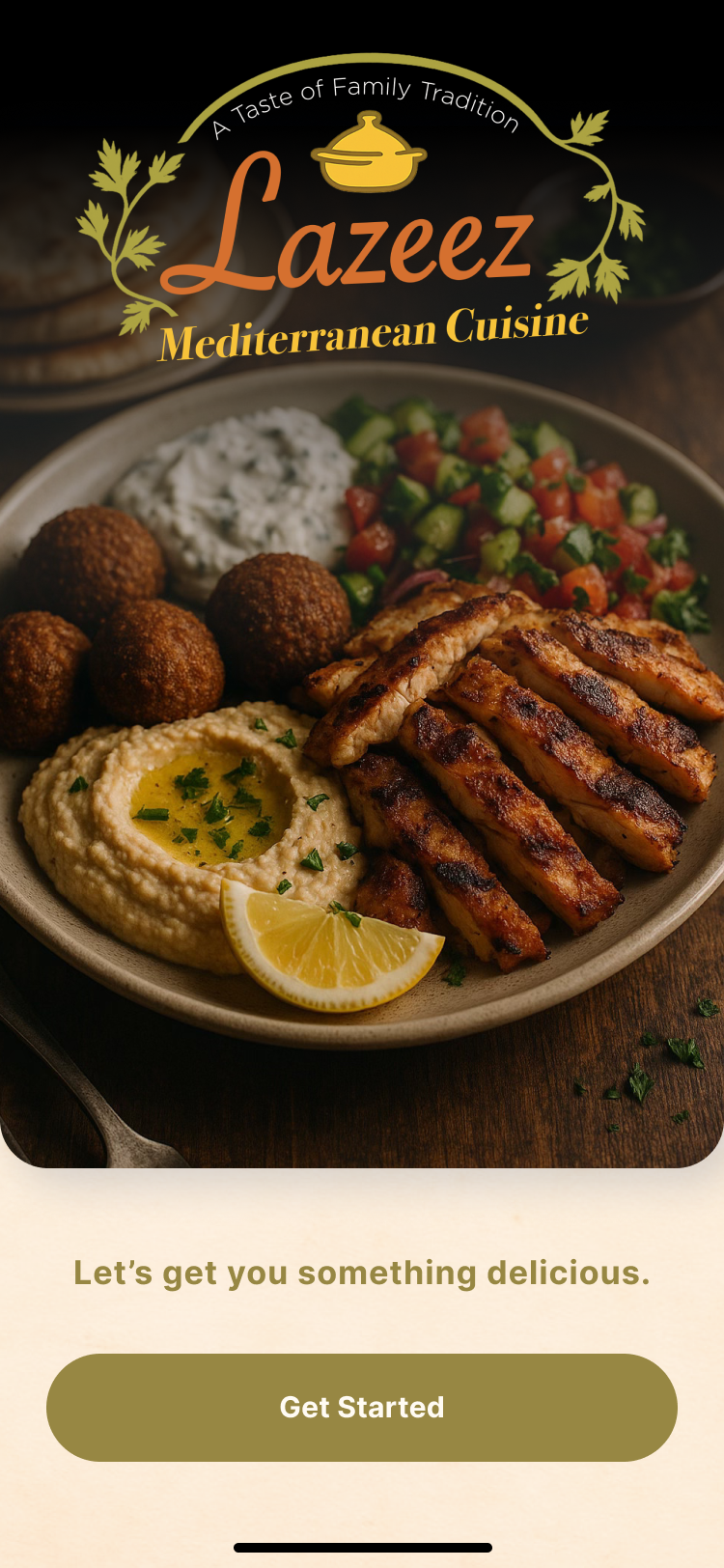
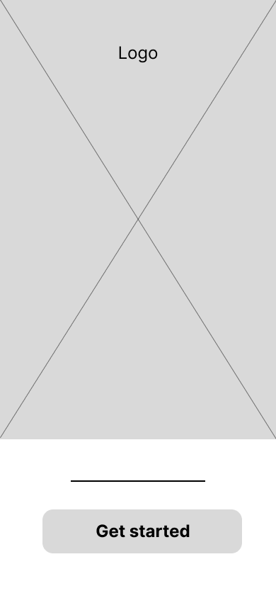
Welcome Screen
- A visually engaging entry point that sets the brand tone.
- A clear “Get Started” call-to-action to initiate the user journey.
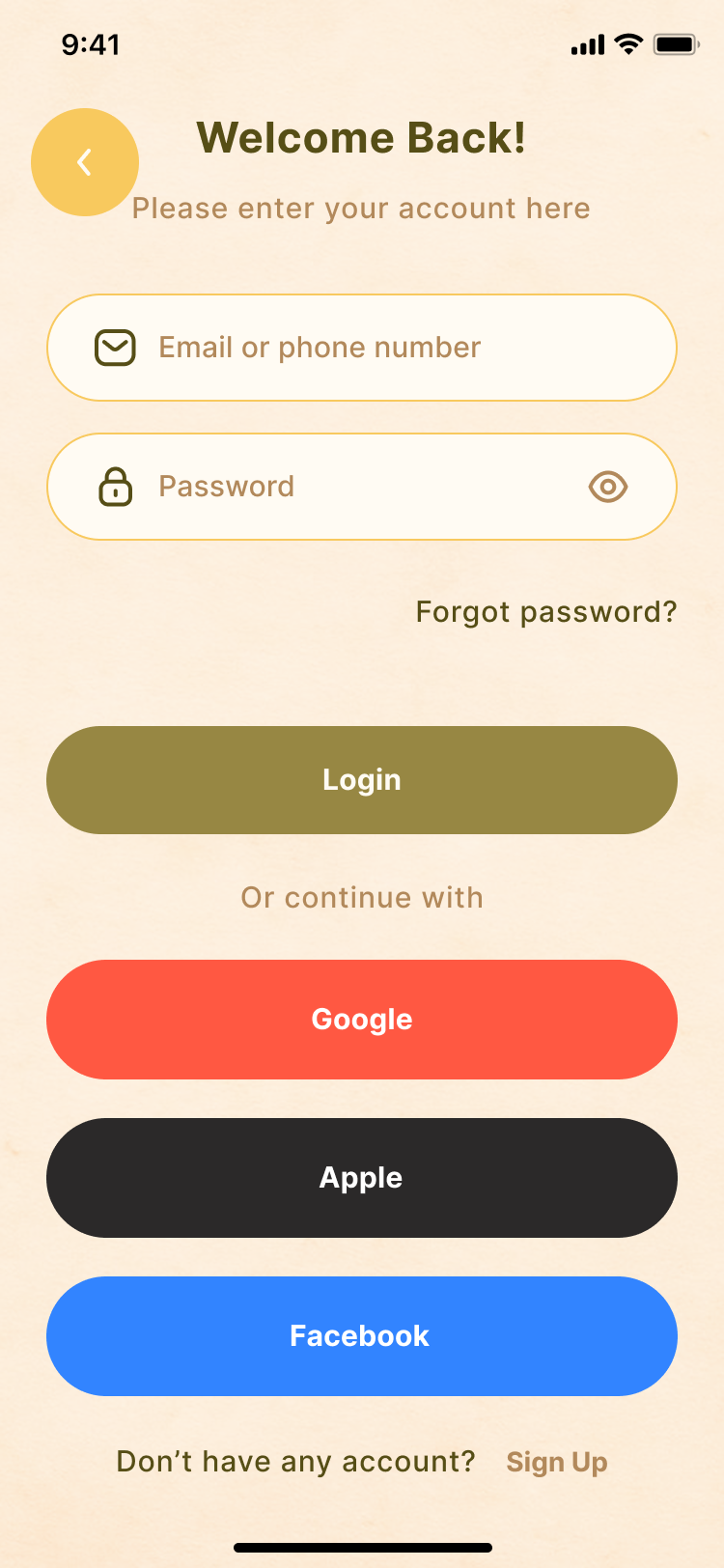
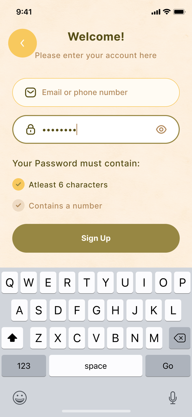
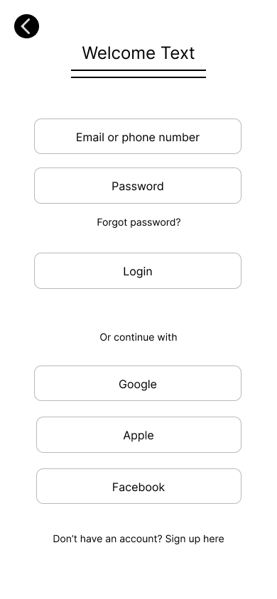
Login/Sign Up Screens
- Login: Features clear fields for email/phone and password, with “Forgot password?” option. Prominently displays social login options (Google, Apple, Facebook) for user convenience.
- Sign Up: Guides users through account creation with password strength requirements.
- Email Verification: A dedicated screen for email verification with a clear code input and resend option, ensuring account security.
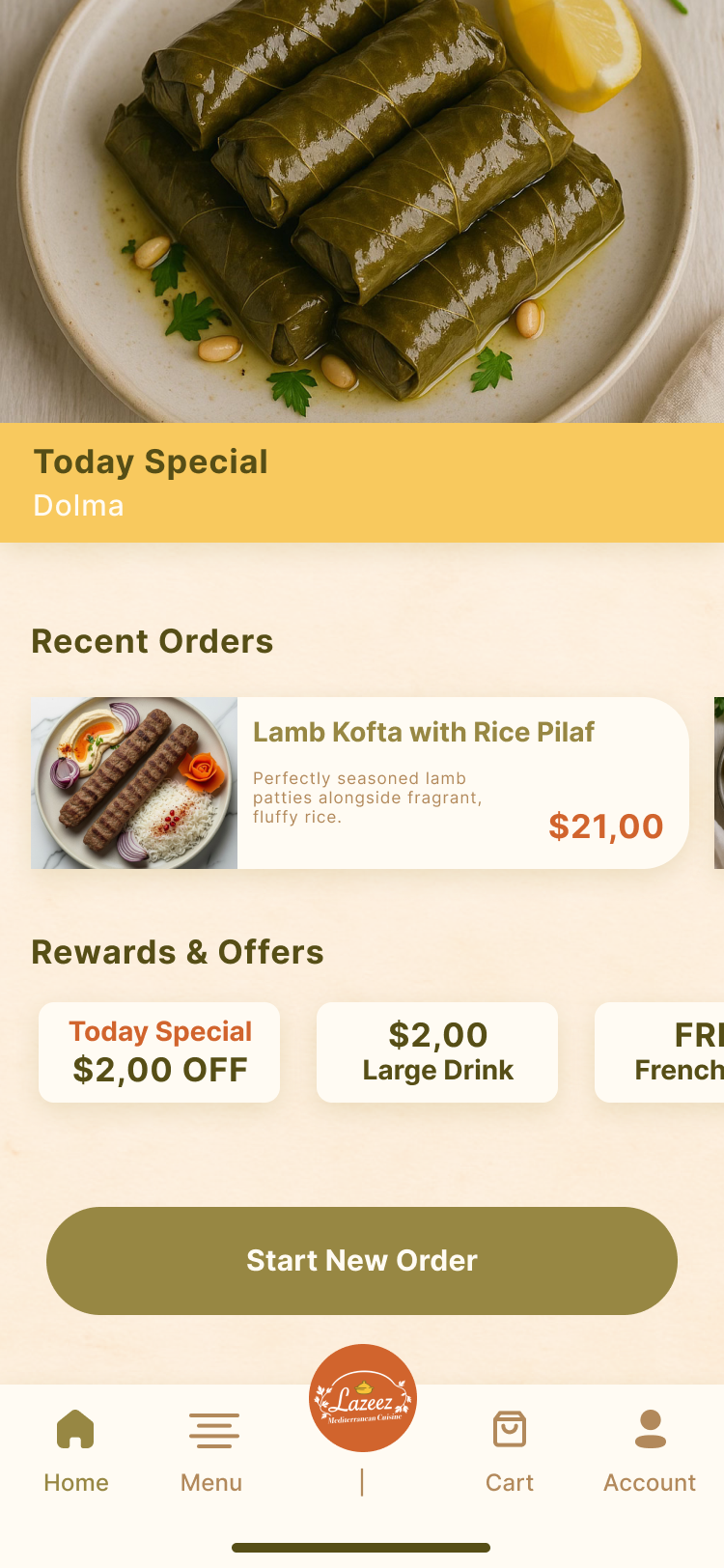
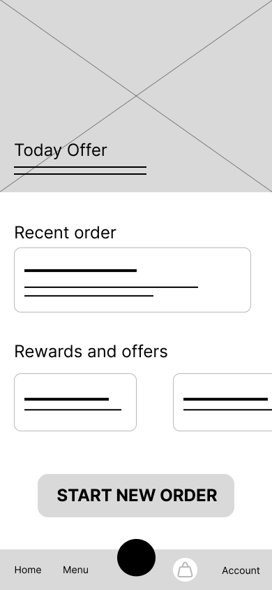
Homepage
- Today’s Special: A prominent section to highlight daily offers with an enticing image and price.
- Recent Orders: Allows quick reordering of frequently purchased items, enhancing efficiency for busy users.
- Rewards & Offers: Clearly visible section to encourage engagement with loyalty programs.
- “Start New Order” Button: A large, central call-to-action for immediate ordering.
- Bottom Navigation: Intuitive navigation bar with “Home,” “Menu,” “Cart,” and “Account” for easy access.
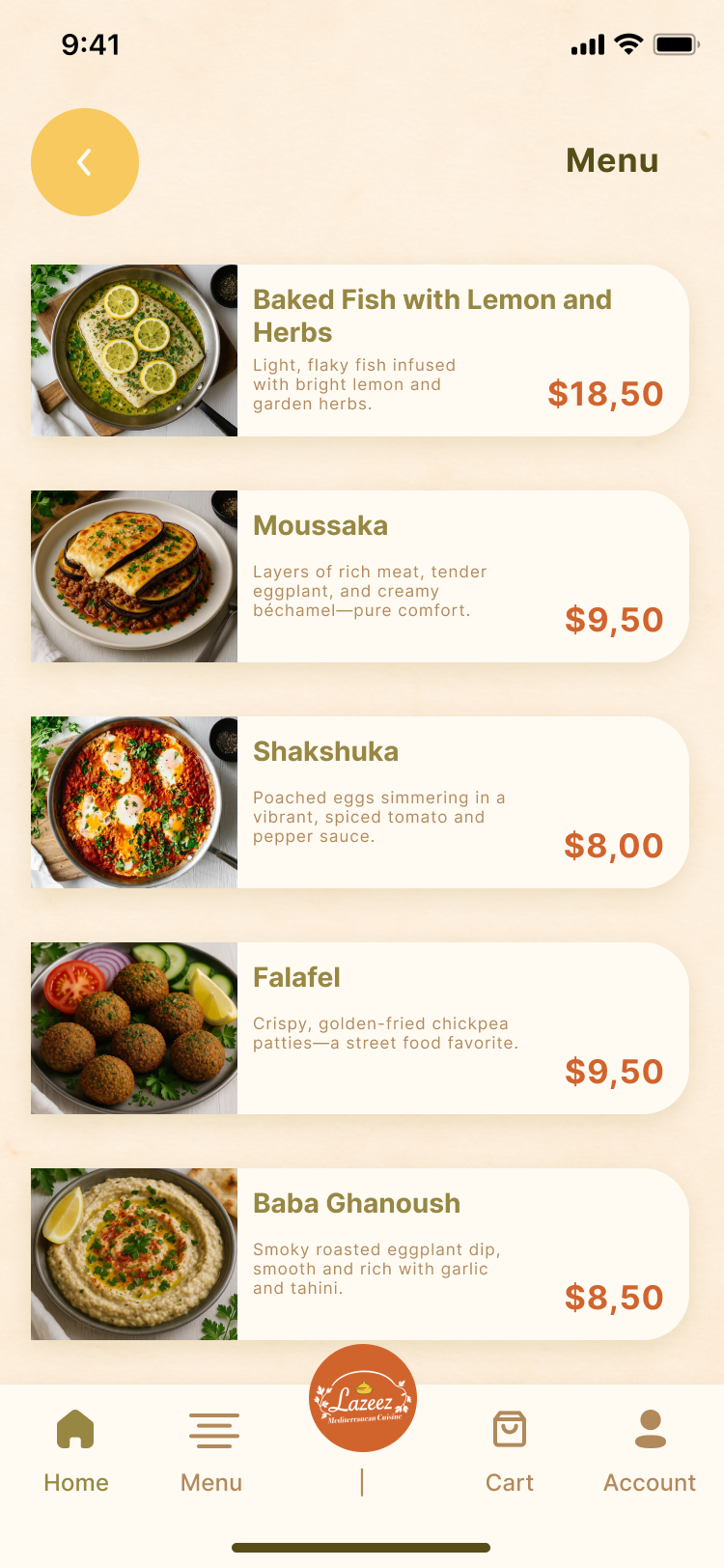
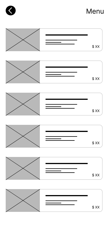
Menu Browsing
- Visual Menu: Each menu item is presented with a high-quality image, name, brief description, and price, directly addressing the need for visual decision-making.
- Clear Navigation: A back button and “Menu” title ensure easy navigation.
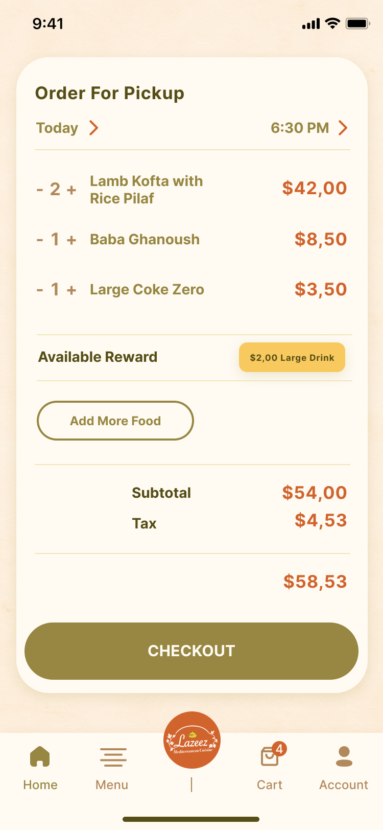
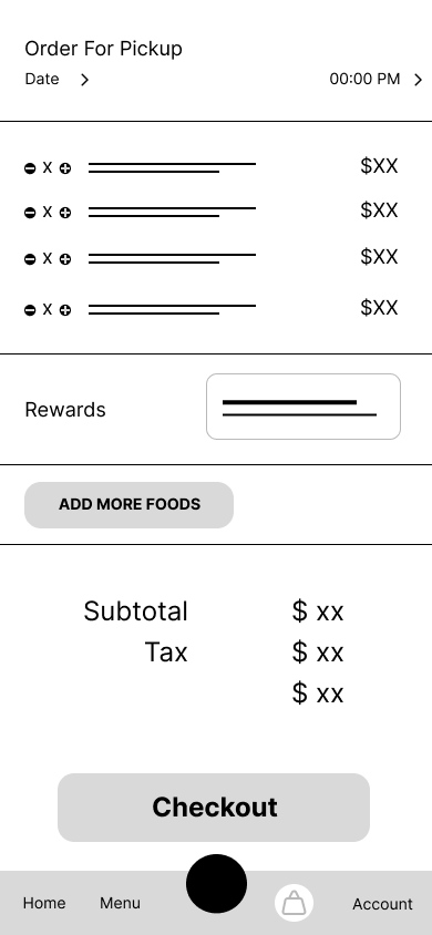
Cart / Order Summary
- Pickup Time Selection: Prominently displays “Order For Pickup” with adjustable date and time, allowing users to plan their pickup precisely.
- Itemized List: Clearly shows quantity, item name, and individual price for each ordered item.
- Reward Integration: “Available Reward” section highlights applicable discounts, increasing user satisfaction.
- Price Breakdown: Transparent display of subtotal, tax, and total.
- “Add More Food” & “Checkout” Buttons: Clear actions to continue shopping or proceed to payment.
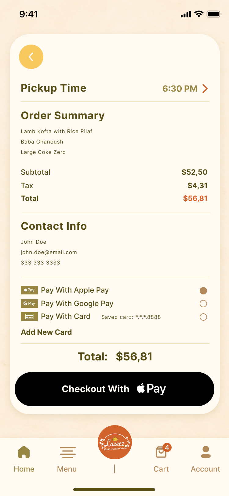
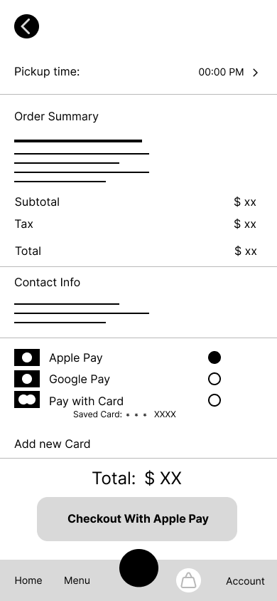
Payment Screen
- Pickup Time Confirmation: Reconfirms the selected pickup time.
- Order Summary: Provides a concise overview of the order items and total cost.
- Contact Info: Displays user contact details for order fulfillment.
- Payment Options: Offers multiple secure payment methods including Apple Pay, Google Pay, and saved card options, eliminating the need for manual credit card entry.
- Total Amount: Clearly shows the final amount due.
- “Checkout With Apple Pay” Button: A prominent button for quick payment completion.
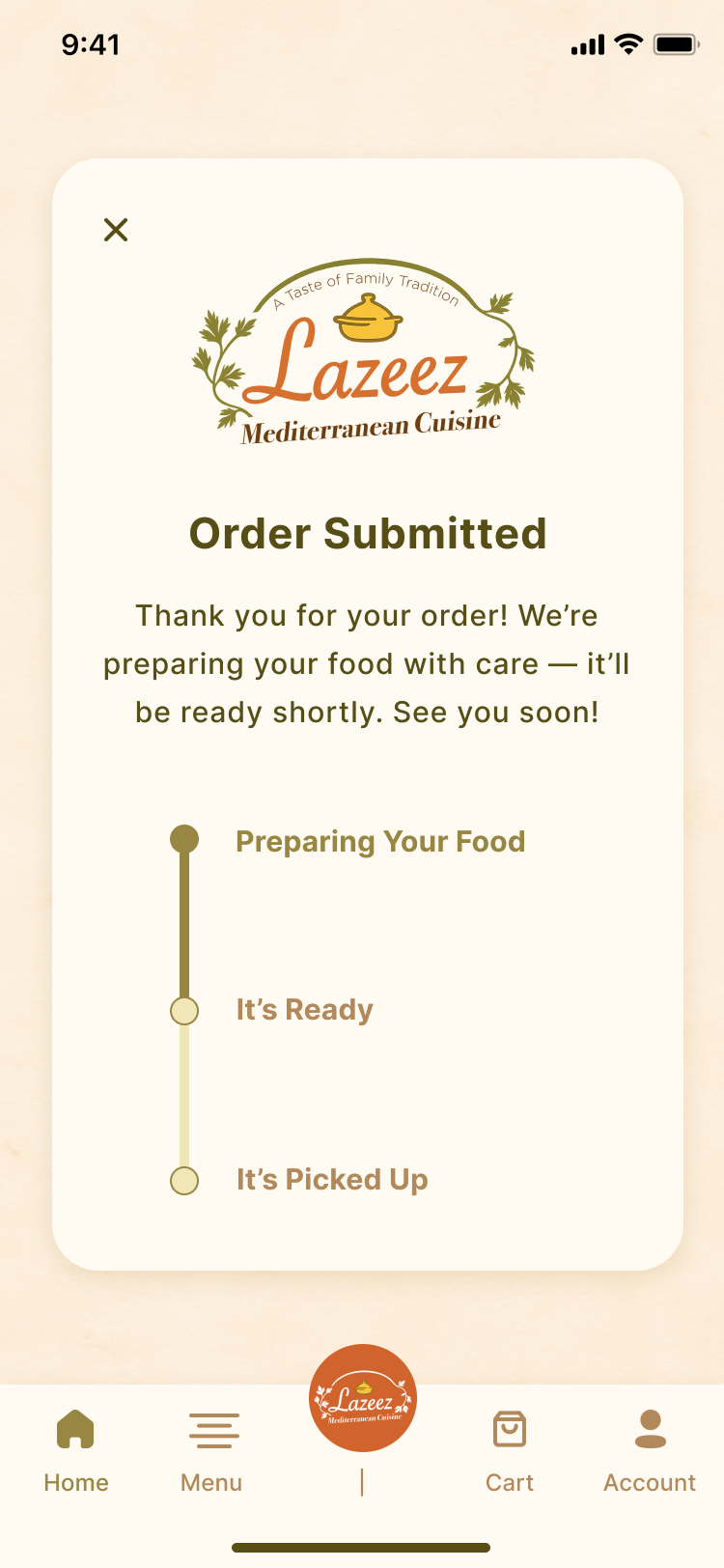
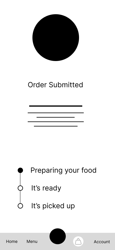
Order Submitted Screen
- Confirmation Message: A friendly message confirming the order submission.
- Real-time Status Tracker: A visual progress bar with “Preparing Your Food,” “It’s Ready,” and “It’s Picked Up” statuses, providing transparency and reducing anxiety.
- Bottom Navigation: Consistent navigation for returning to other sections of the app.
Key Design Highlights:
Visual-First Approach: Rich imagery throughout the menu and order flow to enhance browsing and decision-making.
Intuitive Navigation: Consistent bottom navigation and clear back buttons for effortless movement within the app.
Streamlined Checkout: Multiple payment options and a transparent price breakdown ensure a quick and secure transaction.
Real-time Feedback: Order status tracking provides users with peace of mind and accurate pickup information.
Personalization & Rewards: Integration of recent orders and reward display to foster loyalty and repeat purchases.
Key Achievements of the Prototype
Eliminates Phone-Based Ordering: Provides a robust digital alternative, streamlining the order placement process for both customers and Lazeez staff.
Supports Visual Decision-Making: The rich visual menu enhances accessibility and ease of browsing, particularly beneficial for users who prefer quick scanning over reading long text.
Increases Trust and Loyalty: Real-time order tracking and the display of rewards build customer confidence and encourage repeat business by offering transparency and value.
Empowers Users: Customers can now easily select pickup times, track their orders, and access their account information, saving time and enhancing their overall experience.
Next Steps:
Our iterative design process will continue with:
Usability Testing: Conducting comprehensive testing with real users (Emma, Fatima, Omar types) to validate the design, identify any remaining friction points, and gather feedback on the overall experience. This will help refine the flow and interactions.
Iterating the Menu Interface for Accessibility: Further exploring features beyond visual clarity, such as potential voice navigation or enhanced screen reader support, to ensure an even more inclusive experience.
Developing Loyalty-Based Promotions: Implementing the full functionality of the rewards system, including points accumulation and redemption, to drive customer retention and engagement.